Basic Techniques
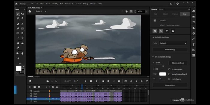
Coloring in Adobe Animate is fundamental to creating engaging and visually appealing animations. This section details various methods for applying color, enabling you to achieve diverse stylistic effects and optimize your workflow. Understanding these techniques will significantly enhance your animation capabilities.
Applying Color to Shapes and Drawings
Adobe Animate offers several ways to apply color. The most common methods include using the Paint Bucket tool for solid fills, the Gradient tool for smooth color transitions, and manually adjusting color values within the Properties panel for precise control. Each method offers unique advantages depending on the desired aesthetic and level of detail. For instance, the Paint Bucket tool is ideal for quickly filling large areas with a single color, while the Gradient tool allows for more sophisticated visual effects.
Manual color adjustment provides the highest level of precision.
Using the Paint Bucket Tool
The Paint Bucket tool is a quick and efficient method for filling shapes with solid colors. To use it, select the Paint Bucket tool from the Tools panel. Choose your desired color from the Color panel. Click on the shape or area you want to fill. If the shape has an open path, the paint bucket will not fill it completely; ensure the shape is closed.
For complex shapes with multiple internal areas, you might need to carefully select each area individually before using the paint bucket.
Creating and Applying Gradients
Gradients create a smooth transition between two or more colors. To create a gradient, select the Gradient tool from the Tools panel. Choose a gradient type (linear or radial) and adjust the color stops and their positions to fine-tune the gradient’s appearance. Click and drag on the object to apply the gradient. The starting point of your click and drag determines the starting point of the gradient, and the ending point determines the ending point.
Experiment with different gradient types and color combinations to achieve various effects.
Creating Custom Color Palettes
Creating custom color palettes ensures consistency and a cohesive visual style throughout your animation. You can create a custom palette using the Color panel, adding colors individually or importing color swatches from external sources. Once created, you can easily select colors from your custom palette to maintain a consistent look and feel across your project. This is particularly useful for branding or maintaining a specific artistic style.
Animation Demonstrating Color Application Methods
Imagine a simple animation of a bouncing ball. The ball could start with a solid red fill (Paint Bucket). On its second bounce, a linear gradient from red to orange could be applied. On its third bounce, a radial gradient from yellow to orange might be used. Finally, the ball might change to a custom color palette with variations of blue and green for the remaining bounces.
This demonstrates the versatility of different coloring methods within a single animation.
Comparison of Color Application Methods
| Method | Speed | Efficiency | Notes |
|---|---|---|---|
| Paint Bucket | High | High for solid fills | Best for simple shapes and solid colors. |
| Gradient Tool | Medium | High for smooth transitions | More versatile than Paint Bucket but requires more setup. |
| Manual Color Adjustment | Low | High for precise control | Ideal for complex shapes and detailed color adjustments. |
| Custom Color Palette | Variable | High for consistency | Improves workflow by providing quick access to pre-selected colors. |
Advanced Coloring Techniques: Coloring In Adobe Animate
Mastering basic coloring in Adobe Animate is only the first step towards creating truly captivating animations. This section delves into advanced techniques, focusing on leveraging layers and effects to achieve professional-level results and optimize performance. Understanding these techniques will significantly improve the visual quality and efficiency of your animations.
Yo, so you’re into coloring in Adobe Animate, huh? That’s rad! It’s way easier to create your own stuff than hunting for pre-made ones, but sometimes you need inspo, right? Check out these awesome coloring pages of anime animals for some ideas on styles and color palettes. Then, get back to that Animate project and unleash your inner digital artist! It’s gonna be epic!
Layer Management for Color Control
Effective layer management is crucial for complex animations. Each layer should ideally represent a distinct element or color group, allowing for precise control and modification without affecting other parts of the animation. For instance, you might dedicate separate layers to character Artikels, skin tones, clothing, and background elements. This approach simplifies the color editing process, preventing accidental changes and facilitating easier animation adjustments.
Grouping related layers into folders further enhances organization, making navigation and modification of complex scenes much more manageable. Consider using descriptive layer names to improve project readability and collaboration.
Applying Color Effects
Adobe Animate offers a variety of built-in effects to enhance the visual appeal of your animations. Glows can add a sense of luminosity and magic, shadows provide depth and realism, while bevels create the illusion of three-dimensionality. These effects can be applied directly to individual layers or groups of layers, offering granular control over the visual style. Experiment with different effect settings – such as blur radius, color intensity, and angle – to achieve the desired artistic effect.
For instance, a subtle glow around a character’s Artikel can emphasize their movement, while a well-placed shadow can make them appear more grounded in their environment.
RGB vs. HSB Color Modes
The choice between RGB (Red, Green, Blue) and HSB (Hue, Saturation, Brightness) color modes depends on your workflow and artistic preferences. RGB is the standard additive color model, ideal for precise color mixing and matching. HSB, on the other hand, allows for intuitive adjustments to color properties, making it easier to modify the overall tone and vibrancy of a color.
For instance, if you need to quickly shift the overall “warmth” of a scene, adjusting the hue in HSB mode is much more efficient than manipulating individual RGB values. However, for precise color matching with external assets, RGB remains the more reliable choice.
Solid Colors vs. Gradients
Solid colors provide a clean, minimalist aesthetic, while gradients offer a wider range of visual possibilities, allowing for smooth transitions between colors and the creation of more complex textures. The choice depends entirely on the desired artistic style. Solid colors are often preferred for simple animations or when a bold, graphic style is desired. Gradients, however, are excellent for creating realistic shading, adding depth to objects, and simulating natural phenomena like sunsets or reflections.
Experiment with different gradient types – linear, radial, and freeform – to achieve diverse visual effects.
Optimizing Color Usage for Performance
Efficient color management is crucial for maintaining optimal animation performance. Overuse of complex effects or high-resolution images can significantly impact frame rates.
- Minimize the number of colors: Using a limited palette reduces the processing load.
- Optimize image size: Use appropriately sized images and avoid unnecessary details.
- Use vector graphics where possible: Vector graphics scale without losing quality, reducing file size.
- Avoid overusing effects: Apply effects sparingly and only where necessary.
- Compress your animation: Use appropriate compression settings during export.
Coloring for Specific Animation Styles
Understanding how color impacts animation style is crucial for creating compelling visuals. Different animation styles utilize distinct color palettes and techniques to achieve their unique aesthetic and emotional impact. This section will explore these aspects, focusing on cartoon, realistic, and mood-driven coloring approaches.
Cartoon Animation Coloring
Cartoon animation often employs bold, saturated colors and simplified shading techniques. Palettes frequently feature high contrast between primary colors, creating a visually striking effect. For example, a classic cartoon might use bright reds, yellows, and blues for characters, with contrasting background colors like deep greens or vibrant purples. Shading might be achieved through simple cell-shading, using flat colors with hard edges to define form, or through a more painterly approach with slightly softer gradients.
Think of the vibrant colors in Looney Tunes or the more muted, but still bold, palette of early Disney cartoons. The overall effect is one of clarity and readability, emphasizing character design and action over photorealism.
Realistic Character Coloring in Adobe Animate
Creating a realistically colored character involves a multi-step process. First, establish a base color that accurately reflects the character’s skin tone, hair color, and clothing. This initial layer forms the foundation for subsequent shading and highlighting. Next, add shadows using darker, desaturated versions of the base colors. These shadows should be placed strategically to indicate the direction of light and the character’s form.
For example, a shadow under the nose, in the creases of the eyes, and along the jawline will add depth to a face. Then, highlight areas exposed to direct light using brighter, more saturated versions of the base colors. These highlights will enhance the character’s three-dimensionality. Finally, consider adding subtle color variations to simulate texture, such as adding warmer tones to the cheeks to suggest a blush or cooler tones to indicate shadows within folds of clothing.
The result should be a character that appears lifelike and three-dimensional.
Maintaining Color Scheme Consistency
Consistency in color schemes is essential for a cohesive animation. One effective method is to create a color palette at the outset of the project. This palette should include primary colors for characters, secondary colors for backgrounds, and accent colors for special effects or details. Using this palette as a guide throughout the animation ensures visual harmony.
Furthermore, consider utilizing color swatches within Adobe Animate to easily select and apply consistent colors across different assets. Using a limited palette also prevents the animation from appearing visually cluttered or chaotic. This approach is particularly important in longer animations or series where consistency is crucial for maintaining visual appeal and brand identity.
Using Color to Convey Mood and Emotion
Color psychology plays a significant role in conveying mood and emotion in animation. Warm colors like reds, oranges, and yellows are generally associated with energy, excitement, and happiness. Cool colors like blues, greens, and purples often evoke feelings of calmness, sadness, or mystery. For example, a scene set in a bright, sunny field with warm colors might feel joyful, while a scene set in a dark forest with cool colors might feel suspenseful or even frightening.
The saturation and brightness of colors also affect mood. Muted colors can create a sense of melancholy or nostalgia, while highly saturated colors can enhance feelings of excitement or intensity. The skillful use of color allows animators to subtly guide the viewer’s emotional response without relying solely on dialogue or sound.
Example Animation: Moods Through Color, Coloring in adobe animate
Imagine a short animation depicting a character’s emotional journey. The scene begins with the character in a brightly lit room, painted in warm yellows and oranges. The character is depicted using bright, saturated colors, and their movements are energetic and playful. This conveys a sense of happiness and joy. As the scene progresses, the lighting shifts, becoming cooler and dimmer, transitioning to blues and purples.
The character’s colors become desaturated, and their movements slow down, reflecting sadness or melancholy. Finally, the scene transitions to a dimly lit area with deep blues and blacks, punctuated by flashes of red to suggest danger or suspense. The character’s color palette shifts to reflect a state of heightened anxiety. This controlled manipulation of color, light, and character design allows the viewer to understand the character’s changing emotional state without explicit verbal cues.
Importing and Using External Assets

Enhancing your Adobe Animate projects with pre-made assets significantly streamlines the workflow and allows for creative exploration. This section details importing external color palettes, adjusting imported asset colors, utilizing color adjustment layers, maintaining color consistency, and integrating these elements into a simple animation. Effective asset management is crucial for efficient and visually cohesive animation production.
Importing Pre-made Color Palettes
Adobe Animate offers several methods for importing color palettes. You can import palettes in various formats, such as ASE (Adobe Swatch Exchange), which is widely compatible with Adobe Creative Suite applications. To import an ASE file, navigate to the Swatches panel in Animate (Window > Swatches), click the menu icon (three horizontal lines), and select “Import Swatches.” Select your ASE file and the colors will be added to your current document’s swatches.
Alternatively, you can manually create a new swatch based on an existing color, by sampling a color from an image or using the color picker to define a specific color value (e.g., hex code, RGB, CMYK). The process is equally simple for other palette formats; however, the exact steps may vary depending on the file type. Consistent use of a central palette ensures visual harmony throughout the animation.

